Fintech Branding and Website Design
Branding and web experiences that turn complicated offerings into confident decisions.
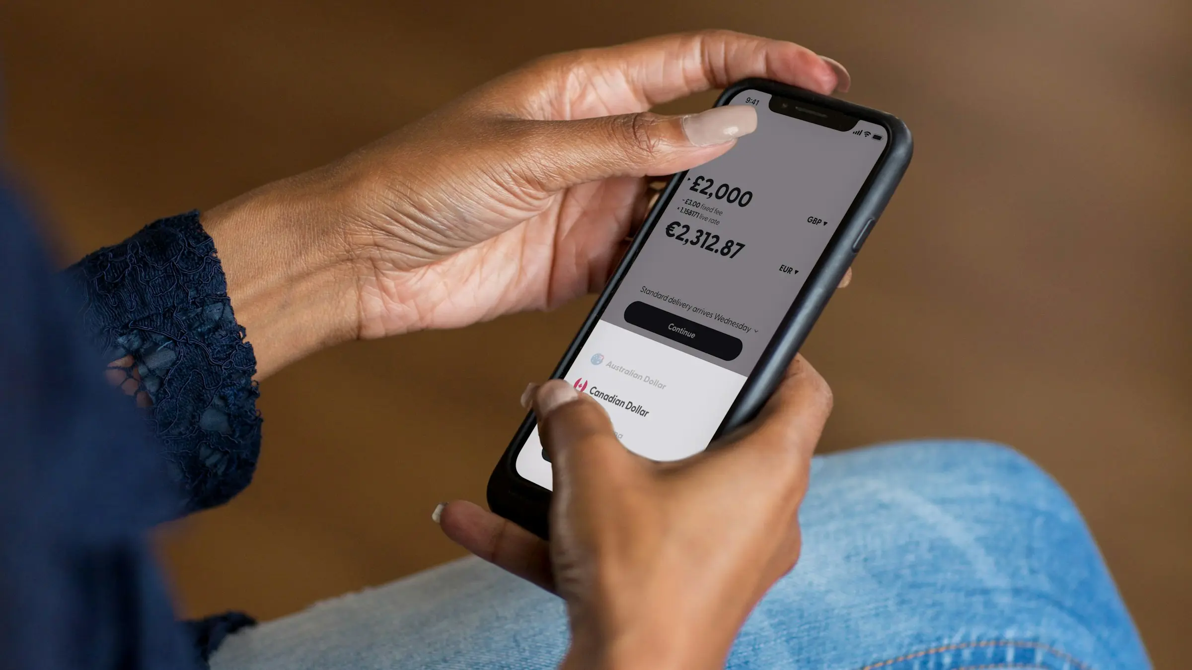
Fintech
Making Complex Products Feel Simple
The Challenge
Money is personal, and trust in a financial product is built slowly and lost quickly. Fintech brands have to make unfamiliar products feel safe, explain regulated features in plain language, and stand apart in a category where many competitors use the same blue gradients and the same promises.
The product itself is usually the hardest thing to communicate. Fees, eligibility, security, and how the product actually works all need explaining, often to people who are cautious by nature and short on time.
How We Help
We start by identifying the moments where users hesitate, such as signing up, linking an account, or making a first transaction, and design the brand and the website to answer those doubts directly. Clarity is the strategy: fewer claims, better explanations, and visible proof of reliability.
Visually, we help fintech brands find a distinct personality that still feels dependable. Typography, colour, and illustration are chosen to make data readable and interfaces calm, and the website is structured so that compliance information is easy to find rather than hidden away.
What We Build for Fintech
Fintech identity systems
Distinctive brands that feel modern without losing the credibility financial products need.
Branding & IdentityExplainer-led websites
Product pages, pricing, and onboarding journeys that make complex features easy to understand.
Website Design & DevelopmentTrust-building content
Guides, FAQs, and newsletters that educate users and support adoption over time.
Content, Design & MarketingProduct and campaign visuals
Feature illustrations, app store assets, and ad creatives that stay clear and on brand.
Content, Design & Marketing
When a complicated product feels simple, people move from curious to confident. That shift is what we design for in every fintech project.
Common Questions
Still have a question? Ask Us Directly
By finding the moments where users hesitate, such as signing up, linking an account, or making a first transaction, and answering those doubts directly. We favour fewer claims, better explanations, and visible proof of reliability.
Yes. Fees, eligibility, security, and how the product works can all be explained in plain language. We build explainer-led websites around the questions cautious users actually ask.
We structure the site so compliance information is easy to find rather than hidden away. The content itself is reviewed and approved by your team before anything goes live.
By finding a distinct personality that still feels dependable, instead of the same blue gradients as everyone else. We choose typography, colour, and illustration that make data readable and interfaces calm.