The Brief
Aangan was born from a family-driven vision of building homes that are made to last. Inspired by the founder's grandfather and father, the business believes a good home should be strong, reliable, and built with quality at its core. At the same time, it wants those homes to feel modern, refined, and thoughtfully designed, bringing together contemporary interiors and the latest technology.
The company was setting out to grow across Delhi NCR and win over premium home buyers. It needed an identity that carried that whole story: the strength of a builder, the warmth of a family, and the polish of a luxury brand. And it needed to stand apart in a category where most builders look and sound alike.
Our Approach
We started with research, not sketches.
Understanding the brand. We mapped who Aangan is and who it is not. It is strong and reliable, premium and elegant, modern and quality-driven. It is not cheap, generic, loud, or old-fashioned. That gave us a set of brand values (strength, trust, quality, reliability, innovation, and a personal touch) and a vocabulary to design with: foundation, architecture, geometry, home, warmth, and the idea of the aangan itself, the open courtyard at the heart of a traditional Indian home.
Understanding the buyer. We looked at the people Aangan builds for, from families with ageing parents and young children to first-time buyers and existing homeowners. What they want is the same: trust, comfort, security, and confidence that their home is built to last.
Understanding the market. We analysed six competing builders and developers, noting what each did well and where each fell short: luxury that ignored construction strength, cluttered or dated logos, generic names, and identities that felt more like large developers than personal home builders. We also studied how one developer used a single Hindi letter as an architectural mark, a reminder that meaning can make a brand far more memorable. The opportunity was clear: where others sold "the future of real estate," Aangan could own "the meaning of home."
Choosing a direction. We built four moodboards, each with its own colour psychology: Modern Roots, Earth & Craft, Heritage Luxury, and Contemporary Opulence. Modern Roots, a cleaner, contemporary take on Indian heritage pairing architectural detail with refined interiors, became the foundation, with hand-drawn concept sketches leading into the final mark.
The Identity
The logo. The icon brings three ideas together, and each one carries meaning.
- The lotus is one of the most auspicious symbols in Hinduism. It grows from muddy water yet blooms clean above it, which makes it a symbol of purity. It is also the seat of Lakshmi, the goddess of prosperity and good fortune, and those are the blessings every family hopes for in a new home.
- The house stands for what Aangan actually builds: strong, reliable homes made to last.
- The circle is the aangan itself, the open courtyard at the heart of a traditional Indian home where the family gathers. In the logo it encloses the lotus and the house and holds the whole mark together, the way a courtyard holds a home together.
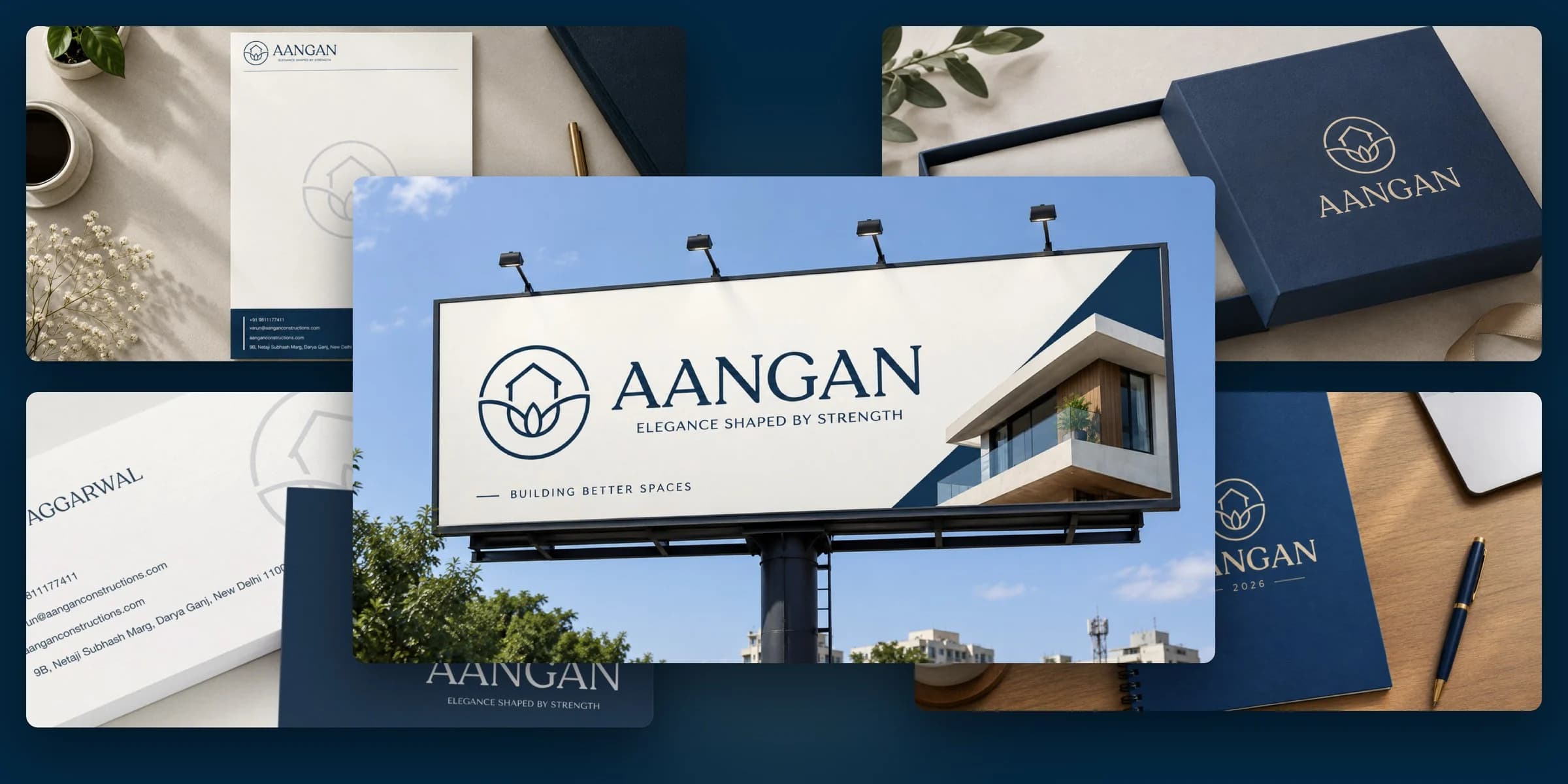
The wordmark is set in elegant serif capitals that convey heritage, luxury, and permanence, and the tagline, "Elegance Shaped by Strength," unites refinement with resilience. The system includes primary and secondary lockups, a standalone icon and wordmark, and clear-space rules so it holds up everywhere.
The colours. Deep Blue (#032741) leads the palette, for trust, stability, and quiet confidence. Sand (#D4B896) brings natural warmth and a hint of craft, Ivory (#F8F4F0) adds calm and timeless elegance, and Charcoal (#2D2D2D) grounds it all. Together they feel premium without being flashy, exactly where Aangan wanted to sit.
The type. Recoleta, with its soft curves and distinctive letterforms, brings warmth, craftsmanship, and personality, so Aangan feels premium and human rather than corporate. Tenor Sans is its clean, understated counterpart for supporting text, balancing character with restraint.
What We Delivered
- Research and creative direction deck: brand story, mind map, keywords, audience analysis, competitor analysis, and a case study
- Four moodboards with colour psychology, and a recommended direction
- Hand-drawn concept exploration
- Final logo: primary and secondary lockups, icon, and wordmark in every brand colour
- Colour palette, typography system, and usage rules
- Brand stationery: business cards and letterheads
- Visual identity and brand guidelines, with the brand shown in action across signage, hoardings, stationery, and packaging
The Outcome
Aangan now has an identity that says what it stands for before a single word is read: a home built on strength, finished with care. It gives a family business with deep roots a brand that can sit confidently alongside much larger developers, and a clear, consistent system to build on as it grows across Delhi NCR.

